Logo on colored background

Brand Guidelines

This guide defines the visual language, tone, and principles behind Georgi — so the brand stays clear and consistent, whoever is making it and wherever it shows up.

​

At its core, Georgi is calm and considered. It works quietly in the background and surfaces only what matters, and the brand is built to feel the same way. This guide sets the standards that carry that character across everything we make — the logo, colour, typography, imagery, and the way we write.

​

Whether you’re designing for screen or print, these guidelines keep every touchpoint composed, legible, and unmistakably Georgi — the same quiet confidence at any size.

Contents

  1. 01 Brand Voice

  2. 02 Logo

  3. 03 Color

  4. 04 Typography

01 Brand Voice

Georgi is a quiet product, and the voice matches it. We write the way the product behaves — calm, plain, and sure of itself. Never loud, never technical for its own sake.

Tone & Voice

Calm,

not loud

The product works in the background.

The voice does too — measured, unhurried, no exclamation marks.

Plain,

not technical

Say it so anyone in the room understands. Everyday words over jargon; a short sentence over a clever one.

Focused,

not busy

One idea at a time. Confident enough to leave space and stop when the point is made.

02 Logo

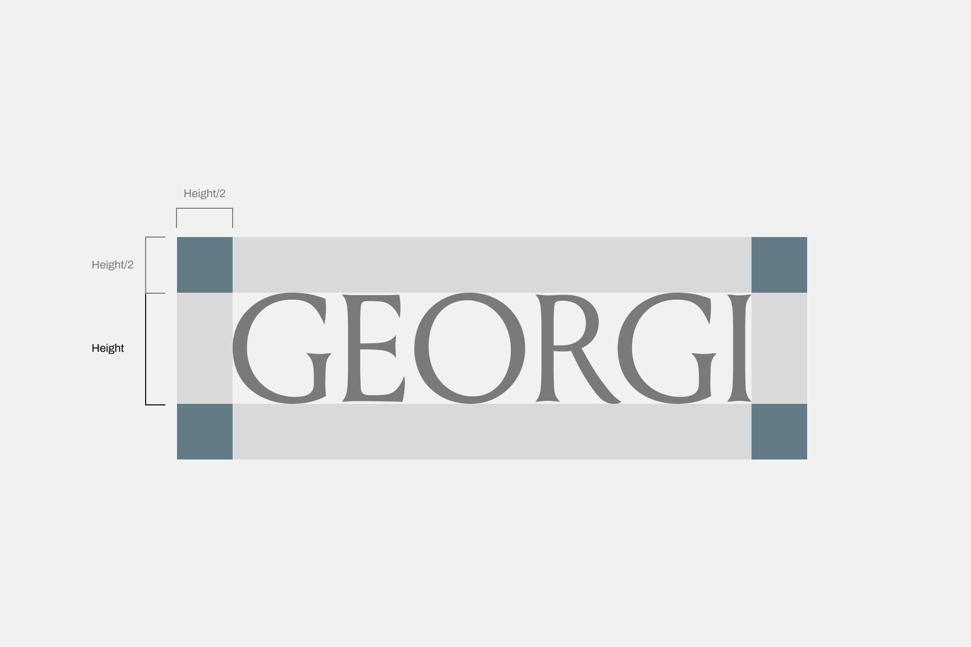
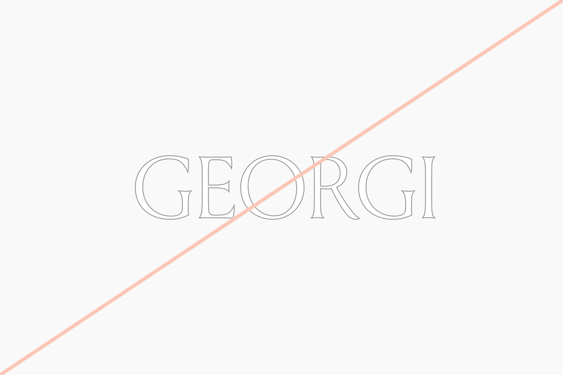
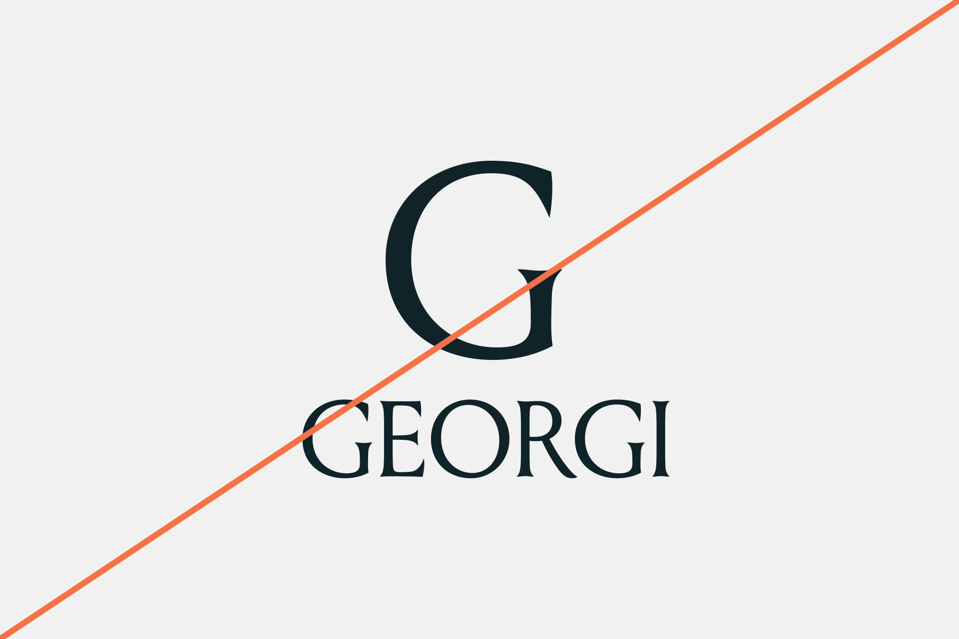
The Georgi logotype is set in Louize Display (205TF). It is always all-caps and locked as drawn — never retype or substitute the letterforms. Keep clear space of at least the cap-height of the G on every side.

Primary Lockup
Image of primary brand logo

Clearspace

Image of brand logo in clearspace

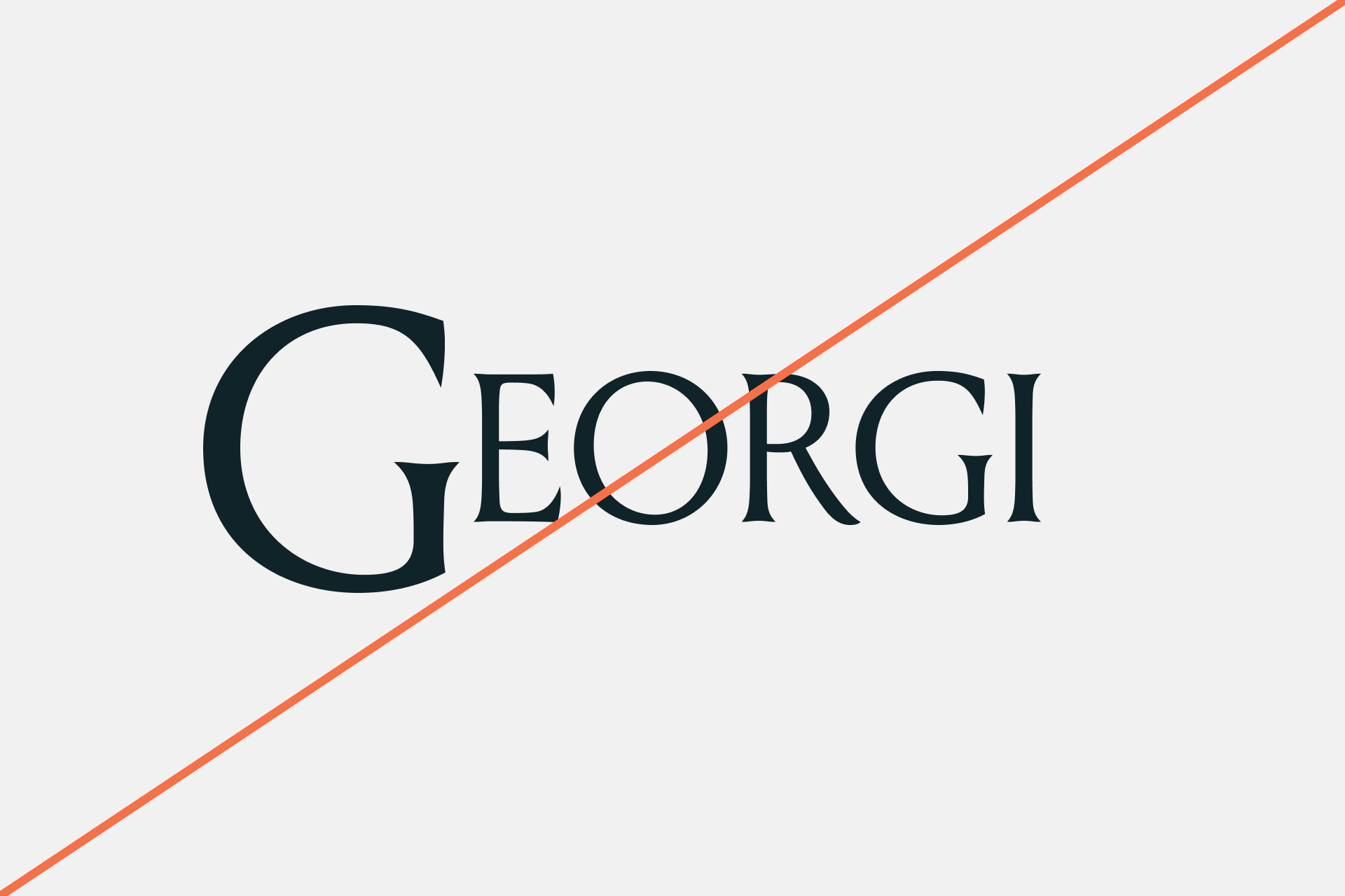
Incorrect Usage

Image of brand logo incorrectly sized

Do not resize the mark

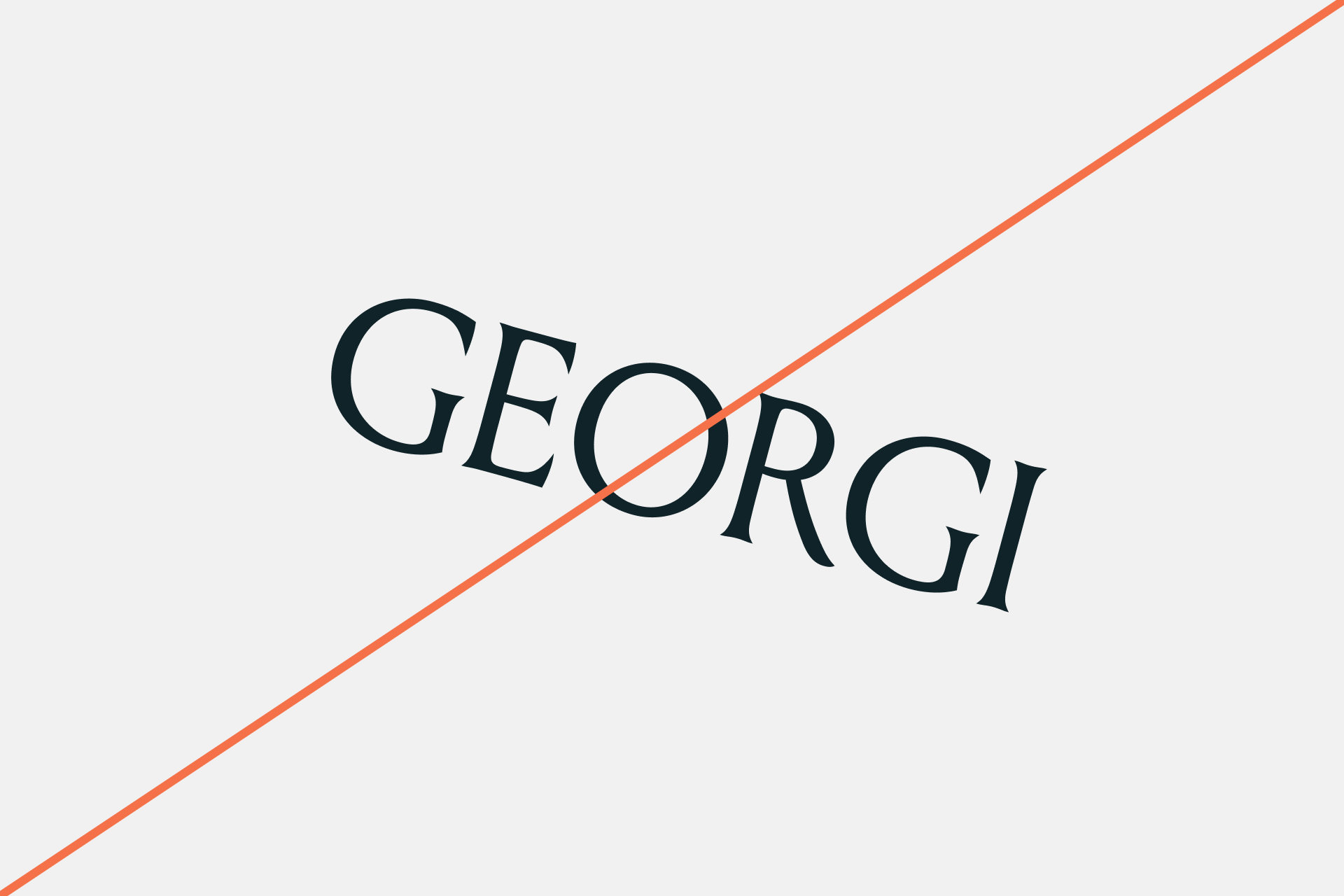
Image of brand logo incorrectly rotated

Do not rotate the logo

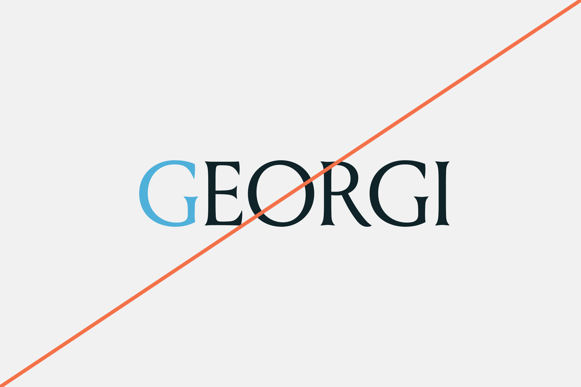
Image of brand logo incorrectly colored

Do not change the color

Image of brand logo incorrectly outlined

Do not outline the logo

Image of brand logo incorrectly ordered

Do not change the lockup

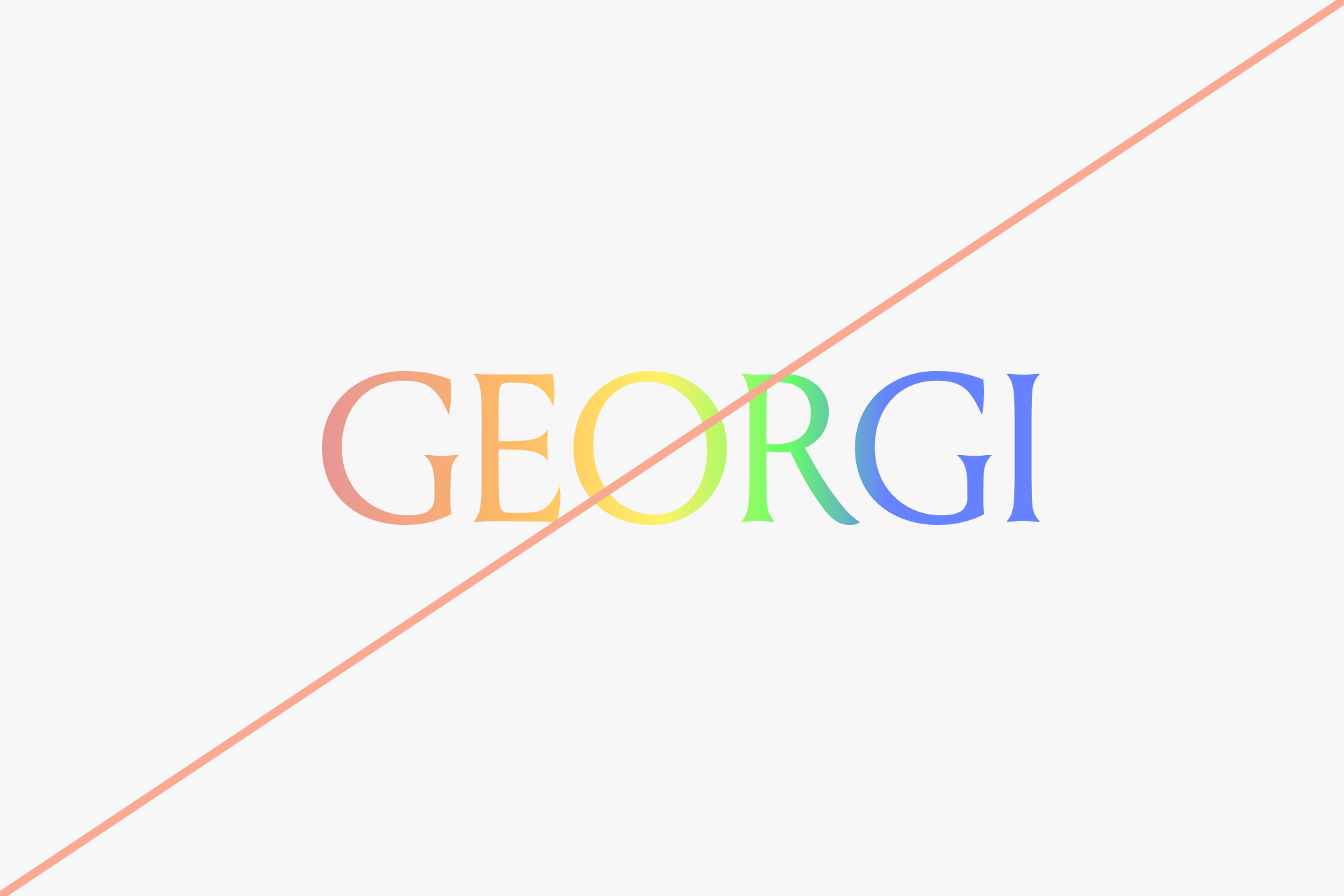
Image of brand logo incorrectly using gradients

Do not add gradients the logo

03 Color

A low-key palette led by Slate, a near-black primary, with a soft Daylight. Amber heads a secondary, functional system — used on light surfaces to add warmth and depth — alongside a set of supporting shades.

Primary Palette

Slate

Hex: #0F2328

Daylight

Hex: #CAD7D9

Petrol

Hex: #234454

Oat

Hex: #E1E1D7

Secondary Palette

Amber

Hex: #4B3333

Olive

Hex: #564E36

Brass

Hex: #C3B98B

04 Typography

Georgi is carried by IBM Plex for English and Noto for Mandarin. In English, IBM Plex Serif leads and IBM Plex Sans carries everything you read. In Mandarin, Noto Sans TC carries the brand across every size.

Primary — IBM Plex SerifIBM Plex Serif is the lead voice of the brand — a measured, credible serif with quiet editorial authority. It sets the headlines, statements and display lines that carry Georgi’s tone: considered, grown-up, sure of itself without raising its voice.

​

Secondary — IBM Plex SansIBM Plex Sans is the clean, engineered workhorse. Its neutral, systematic forms carry everything you read in volume — body copy, labels, numbers, dashboards and interface — with the legibility and precision that data-heavy work demands.

​

The pairingTogether they hold Georgi’s two sides — human yet engineered, confident yet clear. The serif leads and gives the brand its voice; the sans carries the detail and keeps it readable. Kept in balance, every piece stays composed, precise and unmistakably Georgi.

​

Mandarin — Noto Sans TC

Noto Sans TC carries Georgi in Mandarin. Where English splits the voice between a serif and a sans, Mandarin runs on a single family — Noto Sans TC holds headlines, body, labels and data alike. Its even, open forms stay clear from large display down to dense data, and sit in balance beside IBM Plex Sans in bilingual layouts.

English

Primary Typeface

IBM Plex Serif

Secondary Typeface

IBM Plex Sans

Sizing

One proportional scale for both families. The title size is the base; subtitle is 0.4× and content 0.25× of it, so display and body hold the same ratio at any size. Serif leads the two larger tiers; sans carries content.

Georgi sits inside your business and connects what you already have — tills, records, documents, the cameras already on the wall. It gathers all of it into a sense the business can act on, and tells you what’s changing in time to act. Your information stays with you.

Type Sizes 18-22pt/px

120% Leading

0% Tracking

Your business’s information nerve centre.

Type Sizes 32–36pt/px

110% Leading

0% Tracking

Know sooner.

Decide better.

Type Sizes > 72pt/px

100% Leading

0% Tracking

Mandarin

Typeface

Noto Sans TC

Sizing

Mandarin runs on its own proportional scale. Noto Sans TC is visually heavier than the Latin families, so Mandarin titles cap at 60px. From the title, subtitle is 0.3–0.4× and body 0.25-0.3×. The sizes shown are one set calculated from a 60px title; the ratios hold and the actual sizes scale with the title. Leading: 120% display, 140% body; tracking 0%.

串起你本來就有的一切——收銀機、各種紀錄、文件,以及牆上早已架設的攝影機。它把這些匯聚成企業能據以行動的洞察,在變化還來得及應對時就讓你知道。你的資訊,始終留在你這裡。

Type Sizes 18-20pt/px

140% Leading

0% Tracking

你的企業私有 AI,它看見全貌,

讓你及早看見變化,掌握下一步的方向。

Type Sizes 24/px

120% Leading

0% Tracking

看見數字沒告訴你的事。

Type Sizes 60pt/px

120% Leading

0% Tracking

Logo on colored background

Brand Guidelines

This guide defines the visual language, tone, and principles behind Georgi — so the brand stays clear and consistent, whoever is making it and wherever it shows up.

​

At its core, Georgi is calm and considered. It works quietly in the background and surfaces only what matters, and the brand is built to feel the same way. This guide sets the standards that carry that character across everything we make — the logo, colour, typography, imagery, and the way we write.

​

Whether you’re designing for screen or print, these guidelines keep every touchpoint composed, legible, and unmistakably Georgi — the same quiet confidence at any size.

Contents

  1. 01 Brand Voice

  2. 02 Logo

  3. 03 Color

  4. 04 Typography

01 Brand Voice

Georgi is a quiet product, and the voice matches it. We write the way the product behaves — calm, plain, and sure of itself. Never loud, never technical for its own sake.

Tone & Voice

Calm,

not loud

The product works in the background.

The voice does too — measured, unhurried, no exclamation marks.

Plain,

not technical

Say it so anyone in the room understands. Everyday words over jargon; a short sentence over a clever one.

Focused,

not busy

One idea at a time. Confident enough to leave space and stop when the point is made.

02 Logo

The Georgi logotype is set in Louize Display (205TF). It is always all-caps and locked as drawn — never retype or substitute the letterforms. Keep clear space of at least the cap-height of the G on every side.

Primary Lockup

Image of primary brand logo

Clearspace

Image of brand logo in clearspace

Incorrect Usage

Image of brand logo incorrectly sized

Do not resize the mark

Image of brand logo incorrectly rotated

Do not rotate the logo

Image of brand logo incorrectly colored

Do not change the color

Image of brand logo incorrectly outlined

Do not outline the logo

Image of brand logo incorrectly ordered

Do not change the lockup

Image of brand logo incorrectly using gradients

Do not add gradients the logo

03 Color

A low-key palette led by Slate, a near-black primary, with a soft Daylight. Amber heads a secondary, functional system — used on light surfaces to add warmth and depth — alongside a set of supporting shades.

Primary Palette

Slate

Hex: #0F2328

Daylight

Hex: #CAD7D9

Petrol

Hex: #234454

Oat

Hex: #E1E1D7

Secondary Palette

Amber

Hex: #4B3333

Olive

Hex: #564E36

Brass

Hex: #C3B98B

04 Typography

Georgi is carried by IBM Plex for English and Noto for Mandarin. In English, IBM Plex Serif leads and IBM Plex Sans carries everything you read. In Mandarin, Noto Sans TC carries the brand across every size.

Primary — IBM Plex SerifIBM Plex Serif is the lead voice of the brand — a measured, credible serif with quiet editorial authority. It sets the headlines, statements and display lines that carry Georgi’s tone: considered, grown-up, sure of itself without raising its voice.

​

Secondary — IBM Plex SansIBM Plex Sans is the clean, engineered workhorse. Its neutral, systematic forms carry everything you read in volume — body copy, labels, numbers, dashboards and interface — with the legibility and precision that data-heavy work demands.

​

The pairingTogether they hold Georgi’s two sides — human yet engineered, confident yet clear. The serif leads and gives the brand its voice; the sans carries the detail and keeps it readable. Kept in balance, every piece stays composed, precise and unmistakably Georgi.

​

Mandarin — Noto Sans TC

Noto Sans TC carries Georgi in Mandarin. Where English splits the voice between a serif and a sans, Mandarin runs on a single family — Noto Sans TC holds headlines, body, labels and data alike. Its even, open forms stay clear from large display down to dense data, and sit in balance beside IBM Plex Sans in bilingual layouts.

English

Primary Typeface

IBM Plex Serif

Secondary Typeface

IBM Plex Sans

Georgi sits inside your business and connects what you already have — tills, records, documents, the cameras already on the wall. It gathers all of it into a sense the business can act on, and tells you what’s changing in time to act. Your information stays with you.

Type Sizes 18-22pt/px

120% Leading

0% Tracking

Your business’s information nerve centre.

Type Sizes 32–36pt/px

110% Leading

0% Tracking

Know sooner.

Decide better.

Type Sizes > 72pt/px

100% Leading

0% Tracking

Sizing

One proportional scale for both families. The title size is the base; subtitle is 0.4× and content 0.25× of it, so display and body hold the same ratio at any size. Serif leads the two larger tiers; sans carries content.

Mandarin

Typeface

Noto Sans TC

串起你本來就有的一切——收銀機、各種紀錄、文件,以及牆上早已架設的攝影機。它把這些匯聚成企業能據以行動的洞察,在變化還來得及應對時就讓你知道。你的資訊,始終留在你這裡。

Type Sizes 18-20pt/px

140% Leading

0% Tracking

你的企業私有 AI,它看見全貌,

讓你及早看見變化,掌握下一步的方向。

Type Sizes 24/px

120% Leading

0% Tracking

看見數字沒告訴你的事。

Type Sizes 60pt/px

120% Leading

0% Tracking

Sizing

Mandarin runs on its own proportional scale. Noto Sans TC is visually heavier than the Latin families, so Mandarin titles cap at 60px. From the title, subtitle is 0.3–0.4× and body 0.25-0.3×. The sizes shown are one set calculated from a 60px title; the ratios hold and the actual sizes scale with the title. Leading: 120% display, 140% body; tracking 0%.

Logo on colored background

Brand Guidelines

This guide defines the visual language, tone, and principles behind Georgi — so the brand stays clear and consistent, whoever is making it and wherever it shows up.

​

At its core, Georgi is calm and considered. It works quietly in the background and surfaces only what matters, and the brand is built to feel the same way. This guide sets the standards that carry that character across everything we make — the logo, colour, typography, imagery, and the way we write.

​

Whether you’re designing for screen or print, these guidelines keep every touchpoint composed, legible, and unmistakably Georgi — the same quiet confidence at any size.

Contents

  1. 01 Brand Voice

  2. 02 Logo

  3. 03 Color

  4. 04 Typography

01 Brand Voice

Georgi is a quiet product, and the voice matches it. We write the way the product behaves — calm, plain, and sure of itself. Never loud, never technical for its own sake.

Tone & Voice

Calm,

not loud

The product works in the background.

The voice does too — measured, unhurried, no exclamation marks.

Plain,

not technical

Say it so anyone in the room understands. Everyday words over jargon; a short sentence over a clever one.

Focused,

not busy

One idea at a time. Confident enough to leave space and stop when the point is made.

02 Logo

The Georgi logotype is set in Louize Display (205TF). It is always all-caps and locked as drawn — never retype or substitute the letterforms. Keep clear space of at least the cap-height of the G on every side.

Primary Lockup

Image of primary brand logo

Clearspace

Image of brand logo in clearspace

Incorrect Usage

Image of brand logo incorrectly sized

Do not resize the mark

Image of brand logo incorrectly rotated

Do not rotate the logo

Image of brand logo incorrectly colored

Do not change the color

Image of brand logo incorrectly outlined

Do not outline the logo

Image of brand logo incorrectly ordered

Do not change the lockup

Image of brand logo incorrectly using gradients

Do not add gradients the logo

03 Color

A low-key palette led by Slate, a near-black primary, with a soft Daylight. Amber heads a secondary, functional system — used on light surfaces to add warmth and depth — alongside a set of supporting shades.

Primary Palette

Slate

Hex: #0F2328

Daylight

Hex: #CAD7D9

Petrol

Hex: #234454

Oat

Hex: #E1E1D7

Secondary Palette

Amber

Hex: #4B3333

Olive

Hex: #564E36

Brass

Hex: #C3B98B

04 Typography

Georgi is carried by IBM Plex for English and Noto for Mandarin. In English, IBM Plex Serif leads and IBM Plex Sans carries everything you read. In Mandarin, Noto Sans TC carries the brand across every size.

Primary — IBM Plex SerifIBM Plex Serif is the lead voice of the brand — a measured, credible serif with quiet editorial authority. It sets the headlines, statements and display lines that carry Georgi’s tone: considered, grown-up, sure of itself without raising its voice.

​

Secondary — IBM Plex SansIBM Plex Sans is the clean, engineered workhorse. Its neutral, systematic forms carry everything you read in volume — body copy, labels, numbers, dashboards and interface — with the legibility and precision that data-heavy work demands.

​

The pairingTogether they hold Georgi’s two sides — human yet engineered, confident yet clear. The serif leads and gives the brand its voice; the sans carries the detail and keeps it readable. Kept in balance, every piece stays composed, precise and unmistakably Georgi.

​

Mandarin — Noto Sans TC

Noto Sans TC carries Georgi in Mandarin. Where English splits the voice between a serif and a sans, Mandarin runs on a single family — Noto Sans TC holds headlines, body, labels and data alike. Its even, open forms stay clear from large display down to dense data, and sit in balance beside IBM Plex Sans in bilingual layouts.

English

Primary Typeface

IBM Plex Serif

Secondary Typeface

IBM Plex Sans

Sizing

One proportional scale for both families. The title size is the base; subtitle is 0.4× and content 0.25× of it, so display and body hold the same ratio at any size. Serif leads the two larger tiers; sans carries content.

Know sooner.

Decide better.

Type Sizes > 72pt/px

100% Leading

0% Tracking

Your business’s information nerve centre.

Type Sizes 32–36pt/px

110% Leading

0% Tracking

Georgi sits inside your business and connects what you already have — tills, records, documents, the cameras already on the wall. It gathers all of it into a sense the business can act on, and tells you what’s changing in time to act. Your information stays with you.

Type Sizes 18-22pt/px

120% Leading

0% Tracking

Mandarin

Typeface

Noto Sans TC

Sizing

Mandarin runs on its own proportional scale. Noto Sans TC is visually heavier than the Latin families, so Mandarin titles cap at 60px. From the title, subtitle is 0.3–0.4× and body 0.25-0.3×. The sizes shown are one set calculated from a 60px title; the ratios hold and the actual sizes scale with the title. Leading: 120% display, 140% body; tracking 0%.

看見數字沒告訴你的事。

Type Sizes 60pt/px

120% Leading

0% Tracking

你的企業私有 AI,它看見全貌,

讓你及早看見變化,掌握下一步的方向。

Type Sizes 24/px

120% Leading

0% Tracking

串起你本來就有的一切——收銀機、各種紀錄、文件,以及牆上早已架設的攝影機。它把這些匯聚成企業能據以行動的洞察,在變化還來得及應對時就讓你知道。你的資訊,始終留在你這裡。

Type Sizes 18-20pt/px

140% Leading

0% Tracking